
Moving Beyond Descriptive Statistics
We Have Calculated Our Descritpive Statistics - So What?
Just reporting the descriptive statistics results can be informative, but many of us are visual people and we need something visual to see the information at a deeper level. I like to use box plots with whiskers and bell curves to help me go beyond just calculating the descriptive statistics to get a sense of the data. In the visualulization of the descriptive statsitics, we can see things like variance, outliers, skewness, and kurtosis. Let’s take a deep dive in these areas so you can see how to visualize the data and better sentisize descriptive statistics. So, let’s take the raw data that I used in the previous post on Descriptive Statsitics and we will add some visual information.
Lets Begin with Variance and Outliers
We want visual summary that complements numeric measures of variance and highlights unusual data points in one clear graphic. Let’s compare a descriptive statistical table with a powerful visual summary.
Reporting Descriptive Statistics In A Table
In my previous blog post you may remember that I offered the following raw statistical data:
Example Dataset
0.985
0.982
0.980
0.978
0.977
0.976
0.975
0.999
0.963
0.981
Table 1 - Our Example Dataset
If we run the descriptive statstics on this data you would have a descriptive statistics report like the following:
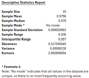
Figure 1 - Example of Descriptive Statistics Report
If you are strickly a numbers person and do not need anything visual, this may be more than enough information for you to see patterns and understand the statistical relevance of the dataset of numbers. I on the other hand need to visualize the data. This is where we can use our box plot with whiskers and bell curves.
However, before we show the visuals for this data set, let’s understand what our visuals do and what they can tell us when we use them. To begin, let’s look at Box Plots with Whiskers.
Understanding the Box Plot with Whiskers
The image below shows a box plot, a statistical chart designed to summarize a dataset’s key distribution features at a glance.
Figure 2 - Example of Box Plot with Whiskers
This plot is built on the following teaching dataset:
Box Plot Teaching Datasett
3
7
8
12
13
014
18
21
23
27
Table 2 - Box Plot Teaching Dataset
Key Components in the Plot
1. The Box (Interquartile Range, IQR)
-
The box spans from the first quartile (Q1) at 8 to the third quartile (Q3) at 21.
-
This range — known as the IQR — contains the middle 50% of all values in our dataset.
-
IQR = Q3 – Q1 = 21 – 8 = 13
2. The Median (Q2)
-
The horizontal line inside the box marks the dataset’s median value, 13.5.
-
Half the values are below this line, and half are above it.
3. The Whiskers (Minimum and Maximum)
-
Lines (or “whiskers”) extend from the box to the smallest data point (3) and largest data point (27) in the dataset.
-
In some box plot conventions, whiskers may stop at a set distance (1.5 × IQR) from the quartiles, with any points beyond shown as outliers — but here, our whiskers extend to the actual min and max values.
4. Labels and Annotations
-
Each critical value (Q1, Q2, Q3, Min, Max) is labeled directly on the plot.
-
The IQR is highlighted with a double‑headed arrow to visually connect the concept of spread to the box width.
Why This Visualization Matters
The box plot lets us:
-
See where most of our data lies (inside the box).
-
Identify central tendency (the median line).
-
Understand spread (IQR and whiskers).
-
Spot potential outliers at a glance.
This particular dataset’s box plot shows that:
-
The middle half of the data lies in a considerably broad range (IQR = 13).
-
The data are fairly symmetric, since the median sits near the center of the box and whiskers are of similar length.
What does a box plot with outliers look like?
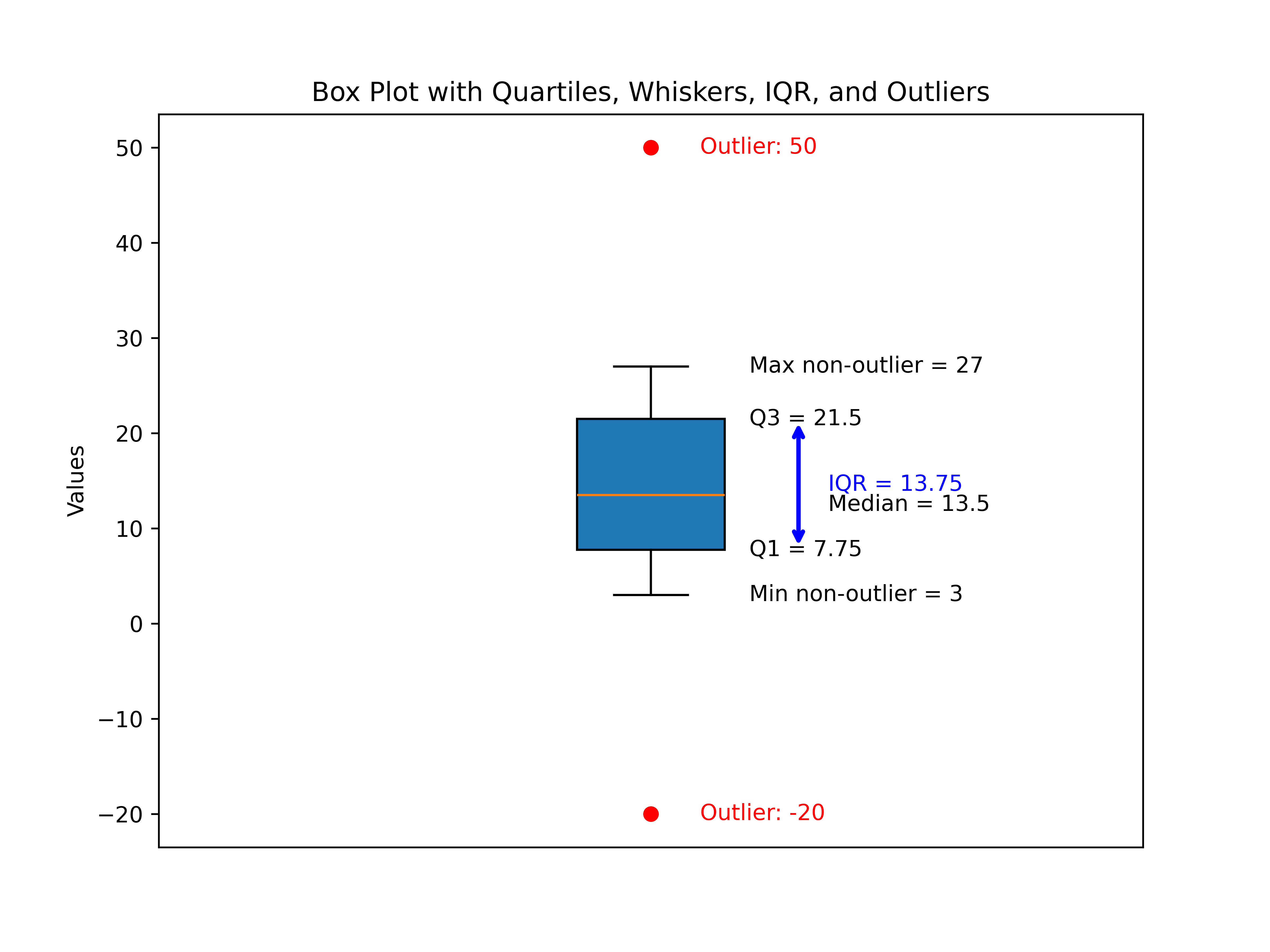
Figure 3 - Example of Box Plot with Whiskers and Outliers
Building on the foundation from Figure 2, which presented our classic box plot from a clean dataset, Figure 3 expands the concept to showcase how box plots reveal outliers—those data points that fall well outside the “typical” range.
This enhanced box plot uses an updated teaching dataset:
Box Plot Teaching Dataset with Outliers
-20
3
7
8
12
13
014
18
21
23
27
50
Table 3 – Teaching Dataset with Outliers
Key Components in the New Plot
1. The Box (Interquartile Range, IQR)
-
The central box again spans from the first quartile (Q1) to the third quartile (Q3).
-
This box still captures the middle 50% of the data—unchanged in concept even when outliers are present.
2. The Median (Q2)
- The horizontal line inside the box marks the dataset’s median, a pivot point that divides the data in half.
3. Whiskers (Minimum and Maximum Non-Outlier Values)
-
With added outliers on both ends, the whiskers no longer reach all the way to the minimum and maximum.
-
Instead, they stop at the lowest and highest non-outlier values—effectively visually separating “ordinary” data from extremes.
4. Outliers: Now Clearly Visible
-
Any data point below Q1 – 1.5 × IQR or above Q3 + 1.5 × IQR is flagged as an outlier.
-
In this dataset, –20 and 50 are outliers:
-
They appear as distinct, colored dots beyond the whiskers on the plot.
-
Labels highlight their status and value, making interpretation easy for any reader.
-
5. Annotations
-
Quartiles, median, whisker endpoints, and IQR are all labeled as before.
-
Outliers are labeled in red, ensuring they stand out as statistical anomalies.
Why This Visualization Matters
This new figure demonstrates the true teaching power of box plots:
-
Outliers are instantly recognizable, with visually and numerically clear separation from bulk data.
-
Whiskers illustrate the reasonable spread, stopping elegantly at the boundaries of typical values.
-
Annotations guide the eye to what matters—central tendency, spread, and the uncommon points worth deeper investigation.
Comparing Figure 2 and Figure 3:
-
Figure 2 presented a symmetric, “well-behaved” box plot, perfect for introducing the concept.
-
Figure 3 introduces the nuance: not all data are tidy, and box plots are built to detect and display extremes explicitly.
Interpreting real-world data often means watching for outliers, as they can represent errors, rare events, or fascinating exceptions. This enhanced box plot makes detecting them quick and comprehensible.
Box Plots - Where Whisker Endpoints End and Outliers Begin
Some may wonder how we seperate whiker endpoints and determine outliers. In traditional box plots, the whiskers extend to the largest and smallest valudes that are not outliers. However, we have to calculate these endpoints and we use the following formulas:
-
Lower Fence:
Lower Fence = Q1 - 1.5 x IQR
-
Upper Fence:
Upper Fence = Q3 + 1.5 x IQR
Definitions for beginners:
-
Q1: First quartile (th 25th percentile).
-
Q3: Third quartile (the 75th percentile).
-
IQR: The range between Q3 and Q1 (IQR = Q3 - Q1).
Steps:
-
Calculate Q1 and Q3, then find the IQR.
-
Find the lower fence and upper fence using the formulas above.
-
The whickers extend to:
-
The smallest data value greater than or equal to the lower fence.
-
The largest data value less than or equal to the upper fence.
Any data points beyond these fences are considered outliers and are plotted separately.
Example
Let’s use our dataset from Table 3
-20
3
7
8
12
13
014
18
21
23
27
50
Table 4 – Teaching Dataset with Outliers
- Q1 = 8.5, Q3 = 21.5 => IQR = 13
- Lower fence: 8.5 - 1.5 x 3 = -10
- Upper fence: 21.5 + 1.5 x 3 = 40
Whiskers end at:
- Smallest value ≥ -10 -> 3
- Largest value ≤ 40 -. 27
Outliers: values < 010(-20) and > 40 (50)
Summarizing Variance and Outliers
-
Variance (Spread): The box plot clearly shows the interquartile range (IQR), which captures the middle 50% of our data, giving a robust measure of spread that isn’t skewed by extreme values. The length of the box and the whiskers visually communicate how data points vary around the median.
-
Outliers: The plot explicitly identifies outliers—data points outside the whiskers defined by 1.5×IQR beyond Q1 and Q3. These outliers are separately marked and labeled, making them easy to spot and understand.
Overall, the box plot provides an intuitive, visual summary that complements numeric measures of variance and highlights unusual data points in one clear graphic.
Understanding Skewness in Data
What Is Skewness?
Skewness is a way to describe how data is spread out—specifically, whether it leans more to one side or is balanced evenly. Imagine a graph showing how many people earn different amounts of money, or how students scored on a test. If the graph is perfectly balanced, it’s called “symmetrical” or “zero skewness.” If it’s stretched out more on one side, it’s “skewed.”
Types of Skewness
1. Balanced (Zero Skewness)
-
What it means: The data is evenly spread on both sides of the center. The left and right sides of the graph are mirror images.
-
Real-life example: Heights of adults in a large group often form a balanced, bell-shaped curve.
-
Why it matters: In balanced data, the average (mean), the middle value (median), and the most common value (mode) are all about the same. This makes it easy to describe the “typical” value.
2. Right Skewed (Positive Skewness)
-
What it means: The graph has a long tail on the right side. Most values are on the lower end, but a few are much higher.
-
Real-life example: Income is often right-skewed. Most people earn average or below-average amounts, but a few earn a lot more, pulling the average up.
-
Why it matters: The average (mean) is higher than the middle value (median), so the mean can be misleading. For example, if a few people in a group are very rich, the average income will look higher than what most people actually earn.
3. Left Skewed (Negative Skewness)
-
What it means: The graph has a long tail on the left side. Most values are on the higher end, but a few are much lower.
-
Real-life example: Age at retirement can be left-skewed. Most people retire around the same age, but a few retire much earlier, pulling the average down.
-
Why it matters: The average (mean) is lower than the middle value (median), so the mean can make it seem like people retire earlier than they actually do.
Why Should Laymen Care About Skewness?
-
Understanding the “Typical” Value: Skewness indicates whether the average (mean) or the median better represents a “typical” case. For instance, in income data, a few very high earners can pull the mean upward, making the average misleading. Knowing skewness helps you see when to rely on the median instead, which better reflects what most people experience.
-
Spotting Outliers: Skewness also reveals the presence of unusual or extreme values that don’t fit the general pattern, like exceptionally high incomes or abnormally low test scores. Recognizing these helps prevent decisions based on misleading averages or faulty assumptions.
-
Making Better Decisions: Knowing your data’s shape supports smarter choices. For example, if house prices show right skewness (a few expensive homes pushing the average up), expecting to pay the average price might lead to budget surprises. Awareness of skewness adjusts expectations realistically.
-
Choosing the Right Tools: Many statistical tests assume your data is balanced and symmetric (normal). When this isn’t the case due to skewness, you may need to use alternative methods or data transformations to get more accurate results. This is especially important in research fields, such as digital and multimedia forensic science, where testing for normality and homogeneity ensures valid conclusions.
Summary Table
Balanced (Zero Skew)
- Shape: Even on both sides
- Example: Adult heights
- Pattern: Mean ≈ Median ≈ Mode
- Watch-Out: Central tendency is reliable
Right Skewed (Positive)
- Shape: Tail extends to the right
- Example: Incomes
- Pattern: Mean > Median
- Watch-Out: Mean exaggerates central tendency
Left Skewed (Negative)
- Shape: Tail extends to the left
- Example: Retirement ages
- Pattern: Mean < Median
- Watch-Out: Mean underrepresents central tendency
Table 5 – Skewness Summary Table
Bottom Line - Skewness is about whether your data is balanced or leans to one side. It helps you understand what’s “typical,” spot unusual values, and avoid being misled by averages. For everyday decisions—like understanding salaries, test scores, or prices—knowing about skewness can help you get a clearer, more accurate picture. So, let’s look at a visual plots of skewness.
Visual Plots of Skewness
In this section, we’ll provide control datasets specifically designed to illustrate different skewness effects. You’ll also learn about two common visualization methods used to view and interpret skewness: the Gaussian curve (also known as the “bell curve”) and the histogram with a Kernel Density Estimate (KDE).
Additionally, for each control dataset, I’ll include a skewness report. This report will demonstrate how applying a logical interpretation framework can aid in determining skewness — or, as we say in forensic science, in making a “finding.”
By combining visual tools with analytical insights, you’ll be better equipped to understand and detect skewness in your own data.
Control Data Sets For Skewness
Here are three normalized (mean≈0, standard deviation≈1) example datasets, each with 10 numbers, illustrating different types of skewness. These are crafted to show classic patterns for left (negative), none (normal), and right (positive) skewness:
1. Left (Negative) Skewness
Most values are higher, but a few low values pull the tail left.
-1.21
-0.83
0.15
0.21
0.33
0.39
0.45
0.62
0.72
1.17
Tail extends to the left, with most data toward the higher end numercally. We can see that here, but let’s visualize it.
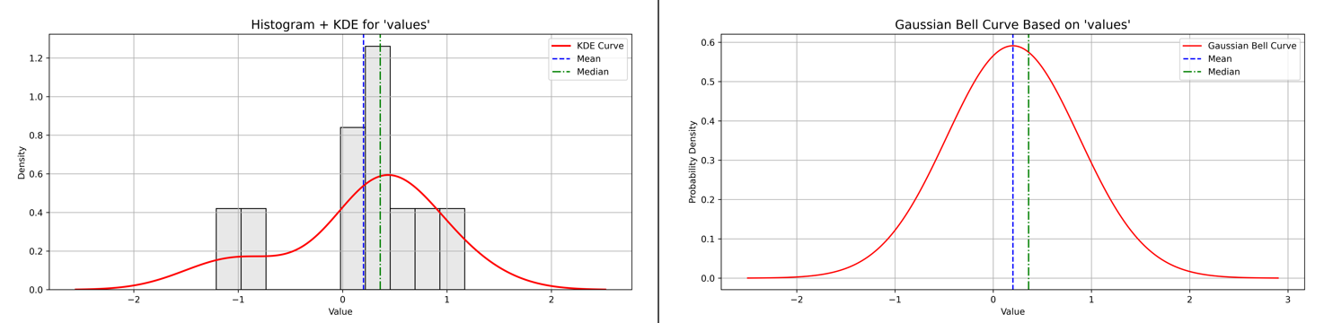
Figure 4 - Example of Left Skewness with Histogram plus KDE and Baussian Curve plots
Let’s look at the Left Skewness report next.
Skewness Analysis Report for ‘values’
Calculated Skewness Value: -0.89
→ Direction: Left-skewed (tail to the left)
→ Interpretation: Moderate skew
Skewness Scale Reference:
- Skew ≈ 0.00 → Symmetric
- 0.00 – 0.49 → Slight skew
- 0.50 – 0.99 → Moderate skew
- ≥ 1.00 → High skew
Figure 5 - Skewness Analysis Report for ‘values’ showing left skewness value, direction, interpretation, and scale reference.
Why does left skew sometimes look close to a normal curve?
-
Left skew means the tail of the distribution stretches out to the left, with some smaller or lower-than-typical values pulling the distribution’s shape.
-
However, when the skewness value is moderate (like –0.89), the bulk of the data still clusters around a central peak, making the overall shape appear similar to a normal (bell-shaped) curve.
-
The difference is subtle but important: the asymmetry caused by lower extremes (lower numbers) shifts the mean slightly left of the median.
-
This means most values are still around the center, but a few smaller values stretch the left tail, creating skewness without dramatically distorting the “bell” shape.
-
For beginners, think of it as a “mostly normal” distribution that’s gently pulled left by some low outliers or extreme values.
2. No Skewness (Symmetrical)
Values are evenly distributed around the mean (close to zero).
-1.29
-0.86
-0.37
-0.08
0.06
0.24
0.36
0.55
0.84
1.55
Appears balanced; mean approximately equals the median.
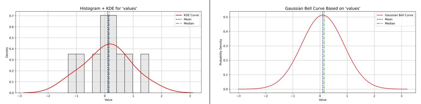
Figure 6 - Example of No Skewness with Histogram plus KDE and Baussian Curve plots
Let’s look at the Balanced Skewness report next.
Skewness Analysis Report for ‘values’
Calculated Skewness Value: -0.02
→ Direction: Left-skewed (tail to the left)
→ Interpretation: Symmetric (approximately normal distribution)
Skewness Scale Reference:
- Skew ≈ 0.00 → Symmetric
- 0.00 – 0.49 → Slight skew
- 0.50 – 0.99 → Moderate skew
- ≥ 1.00 → High skew
Figure 7 - Skewness Analysis Report for ‘values’ showing no skewness value, direction, interpretation, and scale reference.
Understanding This Skewness Report
This skewness report shows a calculated skewness value of –0.02, indicating a very slight left skew (tail on the left), but importantly, it is almost zero. This means the data distribution is approximately symmetric, closely resembling the well-known normal distribution (or bell curve).
What does this mean for you?
-
Symmetry of Data: The nearly zero skewness indicates that the data is balanced, with values evenly distributed around the center. There is no significant stretching on either side of the distribution.
-
Why It Looks Like a Normal Curve: Since the data is symmetric, the mean, median, and mode are all very close together. This gives the classic bell-shaped curve, making it easy to summarize the data with standard statistical methods.
-
Interpretation for Beginners: Even though the report says the distribution is left-skewed, the skew is so small that the dataset behaves almost like typical balanced data. This is a positive sign because many statistical tests rely on this balanced shape for accurate results.
-
Practical Implication: If you are analyzing such data, you can safely use tools and methods that assume normality and interpret central tendency normally, without worrying about distortion from skewness.
3. Right (Positive) Skewness
Most values are low, but a few high values pull the tail right.
-1.26
-0.85
-0.64
-0.31
-0.18
0.21
0.45
0.49
1.05
2.04
Tail extends to the right, with most data toward the lower end.
Figure 8 - Example of No Skewness with Histogram plus KDE and Baussian Curve plots
Let’s look at the Balanced Skewness report next.
Skewness Analysis Report for ‘values’
Calculated Skewness Value: 0.56
→ Direction: Right-skewed (tail to the right)
→ Interpretation: Moderate skew
Skewness Scale Reference:
- Skew ≈ 0.00 → Symmetric
- 0.00 – 0.49 → Slight skew
- 0.50 – 0.99 → Moderate skew
- ≥ 1.00 → High skew
Figure 9 - Skewness Analysis Report for ‘values’ showing right skewness value, direction, interpretation, and scale reference.
Understanding This Right Skewness Report
This skewness report shows a calculated skewness value of 0.56, indicating a moderate right skew—meaning the tail of the distribution stretches out towards larger values on the right.
What does this mean in practical terms?
-
Asymmetry of Data: The longer tail on the right means there are some relatively large values pulling the shape, which can affect the average or mean.
-
Why Right Skew Matters: Because of these larger extremes, the mean is typically greater than the median. This can make the mean misleading as a “typical” value, especially if you expect a balanced or symmetric distribution.
-
Interpretation for Beginners: The data is not perfectly balanced, but the skew isn’t severe. This means while you can use many standard techniques, you should be cautious when interpreting the average, and consider examining the median or using visualization to fully understand the data.
-
Practical Implication: Right-skewed data often appear in contexts such as income distributions, where a few very high earners raise the average, or other measures where extreme high values are common.
Understanding this skewness helps you choose appropriate statistical methods and avoid mistaken conclusions based on averages alone.
Understanding Kurtosis: Beyond Skewness
When exploring the shape of a data distribution, many are familiar with skewness—a measure of asymmetry that tells us if a distribution leans left, right, or remains balanced. But while skewness reveals directional bias in the data, it doesn’t tell the whole story.
This is where kurtosis comes in.
-
Unlike skewness, kurtosis is less concerned with which side the data leans toward and more focused on the weight of the distribution’s tails—that is, how extreme or influential the outliers are.
-
In fact, kurtosis measures how heavy or light the tails are compared to a normal distribution. It captures the risk or frequency of rare, extreme values that can significantly impact analyses and decision-making.
-
Interestingly, a distribution can be highly skewed but still have light or heavy tails regardless of that skew. Conversely, it can be perfectly symmetric but possess heavy tails with many outliers—or light tails indicating fewer extreme events.
Understanding kurtosis alongside skewness helps build a more complete picture of your data’s shape and the potential risk of outliers lurking in the extremes.
In the following section, we’ll dive into the kurtosis of your data sets—left skewed, balanced, and right skewed—to reveal insights about their tail behavior and what it means for data analysis.
Left (Negative) Skewness: Interpreting Kurtosis and Tail Risk
The left-skewed dataset is characterized by most values clustering toward the higher end, while a few lower values extend the tail to the left. This asymmetry is captured by its negative skewness, reflecting the longer left tail.
To understand the nature of the tails and the risk of extreme values (outliers), we examine the kurtosis of the distribution.
Kurtosis Analysis Report for Left-Skewed Data:
-
Calculated Excess Kurtosis: -0.07
-
Interpretation: Approximately normal tails (mesokurtic)
-
Explanation: The excess kurtosis close to zero indicates that the tails of this distribution resemble those of a normal distribution. The frequency and severity of extreme values—both low and high—are about what we would expect under normal conditions.
This means the data does not exhibit unusually heavy or light tails despite the negative skewness. Therefore, the risk of extreme outliers or rare events is typical, neither elevated nor reduced compared to a normal distribution.
Kurtosis Scale Reference:
-
≈ 0.00 → Normal tails (mesokurtic)
-
0.00 → Heavy tails (leptokurtic)
-
< 0.00 → Light tails (platykurtic)
Glossary:
-
Mesokurtic: Tails similar to normal distribution; typical frequency of extreme values—outlier risk is average.
-
Leptokurtic: Heavy tails and sharper peak; more extreme values/outliers; higher risk of rare events.
-
Platykurtic: Light tails and flatter peak; fewer extreme values; lower risk of extreme outliers.
Visualizing these characteristics helps greatly to grasp this concept intuitively.
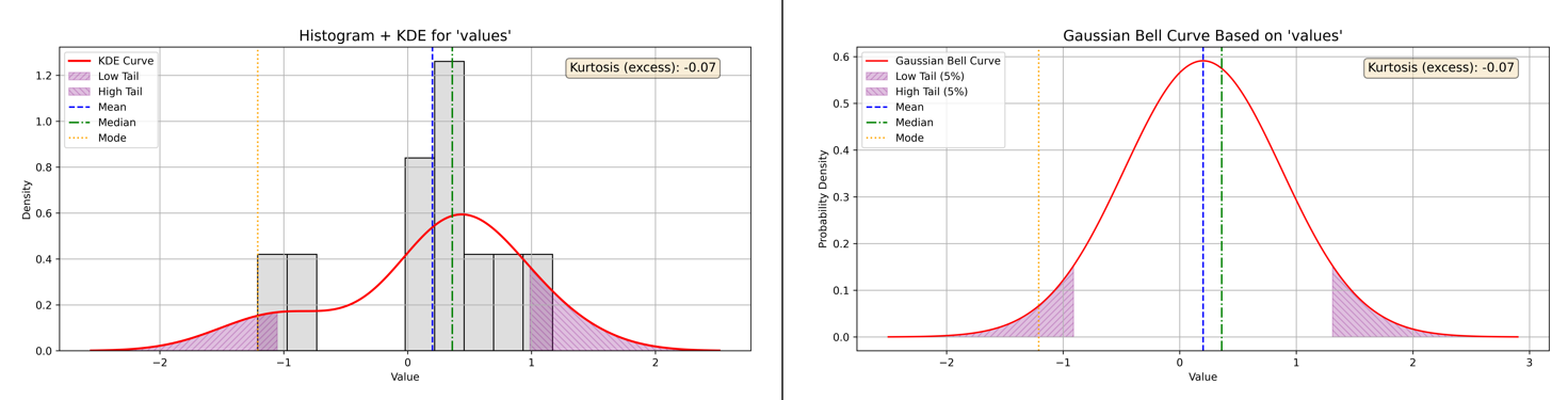
Figure 10 - Example of Kurtosis and Left Skewness with Histogram plus KDE and Baussian Curve plots
Balanced (Zero) Skewness: Kurtosis and Outlier Frequency
The balanced (zero-skewed) dataset presents data distributed evenly around the mean, with no prominent tail extending to either side. This symmetry is typical of a normal distribution, but symmetry alone does not indicate how prone the data is to outliers or extreme values. That’s where kurtosis offers valuable insight.
Kurtosis Analysis for Balanced Data:
-
Calculated Excess Kurtosis: -0.43
-
Interpretation: Light tails and flat peak (platykurtic)
-
What It Means: The excess kurtosis of -0.43 signifies that this dataset has lighter than normal tails and a flatter central peak. In practical terms, this means there are fewer extreme values—data points that stray far from the mean—than you would expect from a normal distribution.
A platykurtic distribution’s shape is less concentrated at the center and less pronounced at the extremes. The risk of rare, outlier events is lower, making this kind of distribution appealing when stable, predictable results are preferred.
Kurtosis Scale Reference:
-
≈ 0.00 → Normal tails (mesokurtic)
-
0.00 → Heavy tails (leptokurtic)
-
< 0.00 → Light tails (platykurtic)
Below, see Figure 11 for side-by-side plots illustrating the actual shape and tails of the balanced-skewness data.
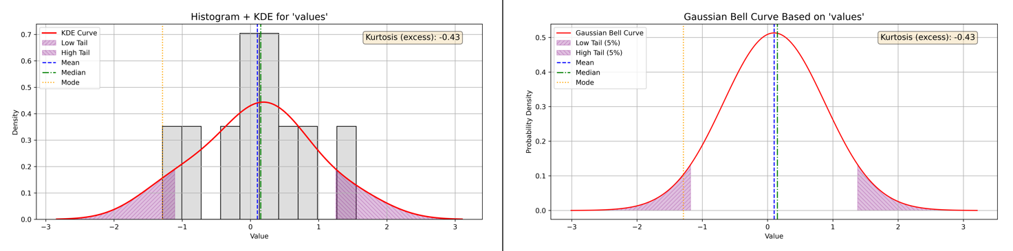
Figure 11 - Example of Kurtosis and Balanced Skewness with Histogram plus KDE and Baussian Curve plots
Right (Positive) Skewness: Interpreting Kurtosis and Outlier Risk
The right-skewed dataset features most values clustered toward the lower end, with a few high values stretching the tail to the right—characteristic of positive skewness. While this skewness highlights asymmetry, it doesn’t reveal how likely the data are to produce rare, extreme outliers.
Kurtosis fills this gap.
Kurtosis Analysis for Right-Skewed Data:
-
Calculated Excess Kurtosis: -0.29
-
Interpretation: Light tails and flat peak (platykurtic)
-
What It Means: With an excess kurtosis of -0.29, the dataset’s tails are lighter than those of a normal distribution, and the central peak is flatter. This platykurtic structure means the likelihood of observing extreme values—those far from the mean—remains typical or even lower than expected.
In other words, although the data demonstrate a strong right tail due to skewness, the actual risk of outliers in those tails is not elevated. The distribution favors predictability, with fewer surprises lurking at the extremes.
Kurtosis Scale Reference:
-
≈ 0.00 → Normal tails (mesokurtic)
-
0.00 → Heavy tails (leptokurtic)
-
< 0.00 → Light tails (platykurtic)
Refer to Figure 12 below for side-by-side plots that illustrate the real-world distribution and tail behavior for this right-skewed dataset.
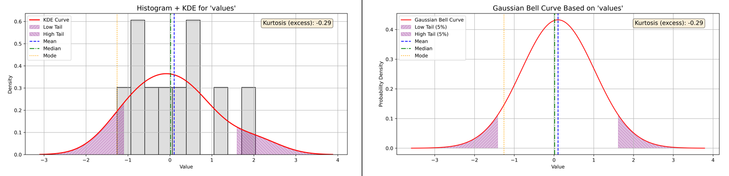
Figure 12 - Example of Kurtosis and Right Skewness with Histogram plus KDE and Baussian Curve plots
Kurtosis: Key Takeaways
Across all three data scenarios—left, balanced, and right skewed—kurtosis provided crucial insight into how frequently extreme values occur, independent of the distribution’s symmetry. In these examples, negative excess kurtosis reflected lighter tails and fewer outliers than a normal distribution, emphasizing predictable data behavior even when skewness varied. By pairing kurtosis with skewness, you gain a more complete understanding of both the direction and “riskiness” of your data’s extremes.
Comparing Skewness and Kurtosis Calculations: Excel, Python, MATLAB, Octave, and R
When analyzing data shape characteristics like skewness and kurtosis, it’s important to understand the differences in how various tools calculate these measures. This affects the values you see and ensures you interpret results correctly.
Excel’s Method
-
Excel’s built-in functions, SKEW and KURT, compute sample skewness and sample excess kurtosis, respectively.
-
Normalization and bias correction:
Both formulas include adjustments for sample size to provide unbiased estimates for sample data (not population parameters). Specifically, SKEW and KURT compensate for small sample sizes, which otherwise could bias the estimates.
-
Kurtosis convention:
-
Excel reports excess kurtosis, meaning a normal distribution has a kurtosis value of 0 (because Excel subtracts 3 from Pearson’s kurtosis).
-
Excel’s kurtosis formula focuses primarily on the tails (extreme values), not the peak shape, even though the term “peakedness” is often used in descriptions.
-
Python’s scipy.stats
-
Python’s scipy.stats functions for skewness (skew) and kurtosis (kurtosis) use similar formulae based on standardized moments.
-
By default, kurtosis is reported as excess kurtosis (normal = 0) like Excel.
-
Both functions offer a bias parameter:
-
bias=False applies bias correction, providing unbiased estimators similar to Excel’s approach.
-
bias=True (default) uses a simpler formula that may be biased for small samples.
-
-
For kurtosis, Python additionally offers a fisher parameter:
-
fisher=True returns excess kurtosis (normal = 0).
-
fisher=False returns Pearson kurtosis (normal = 3), similar to Excel’s base kurtosis before subtracting 3.
-
MATLAB and Octave
-
Both MATLAB and Octave provide functions for skewness and kurtosis, but their defaults and options differ slightly from Excel and Python.
-
MATLAB:
-
The skewness and kurtosis functions calculate sample skewness and sample kurtosis by default, including bias correction similar to Python’s bias=False.
-
MATLAB’s kurtosis returns Pearson kurtosis by default (normal = 3), not excess kurtosis, but the excess kurtosis can be computed by subtracting 3 manually.
-
-
Octave:
-
Octave’s statistical functions aim for compatibility with MATLAB, so they behave similarly.
-
Users often need to manually adjust for excess kurtosis by subtracting 3 if desired.
-
-
Unlike Python’s scipy.stats, MATLAB and Octave do not provide built-in options to toggle bias correction or excess vs Pearson kurtosis directly—users adjust manually as needed.
Skewness and Kurtosis in R
-
In R, the calculation of skewness and kurtosis depends on the package you choose to use.
-
The popular moments package provides functions that calculate sample skewness with bias correction, delivering an unbiased estimate.
- Its kurtosis() function returns the Pearson kurtosis, where a normal distribution has a value of 3, so users often manually subtract 3 to obtain excess kurtosis.
-
Alternatively, the psych package calculates excess kurtosis by default and offers further options to adjust the estimates.
This flexibility in R mirrors Python’s approach, allowing users to select the most appropriate calculation method for their analysis, and is similar to MATLAB’s default of reporting Pearson kurtosis rather than excess kurtosis.
Summary
| Tool | Skewness Bias Correction | Kurtosis Report Type | Bias Correction Option | Notes |
|---|---|---|---|---|
| Excel | Yes | Excess kurtosis (normal = 0) | No | Sample unbiased formulas used |
| Python | Optional (bias param) |
Excess (default) or Pearson | Yes | Default biased; set bias=False for unbiased estimators; toggle fisher for kurtosis |
| MATLAB | Yes | Pearson kurtosis (normal = 3) | No | Manual excess kurtosis = kurtosis - 3 |
| Octave | Yes | Pearson kurtosis (normal = 3) | No | Similar to MATLAB |
| R | Optional (package dependent) | Pearson or Excess kurtosis (depends on function) | Yes (in some packages) | moments package returns Pearson kurtosis; psych package returns excess kurtosis by default; bias correction available depending on function |
Understanding these differences helps us select appropriate formulas and interpret results consistently.
From Descriptive Statistics to Visual Insights: Box Plots, Skewness, and Kurtosis
Up to this point, our focus has been on numerical descriptors—measures of central tendency, spread, skewness, and kurtosis—that quantified the shape and concentration of our data. While these values provide precision, they can sometimes obscure the visual story of the distribution. To bring these numerical patterns into clearer view, we now turn to the box plot, a compact graphical summary that highlights quartiles, spread, and potential outliers in a single glance.
Box Plot Analysis
Building on our descriptive statistics from the special dataset introduced in the previous post, we now move to a visualization that compresses quartiles, spread, whiskers, and potential outliers into a single graph: the box plot (Figure 13).
Box Plot Report:
-
Quartiles: Q1 = 0.9763, Median = 0.9790, Q3 = 0.9818
-
Interquartile Range (IQR): 0.0055
- Fences:
- Lower = 0.9680,
- Upper = 0.9900
- Whiskers:
- Minimum (non-outlier) = 0.9750,
- Maximum (non-outlier) = 0.9850
-
Outliers:
- Below Lower Fence: 0.9630
- Above Upper Fence: 0.9990
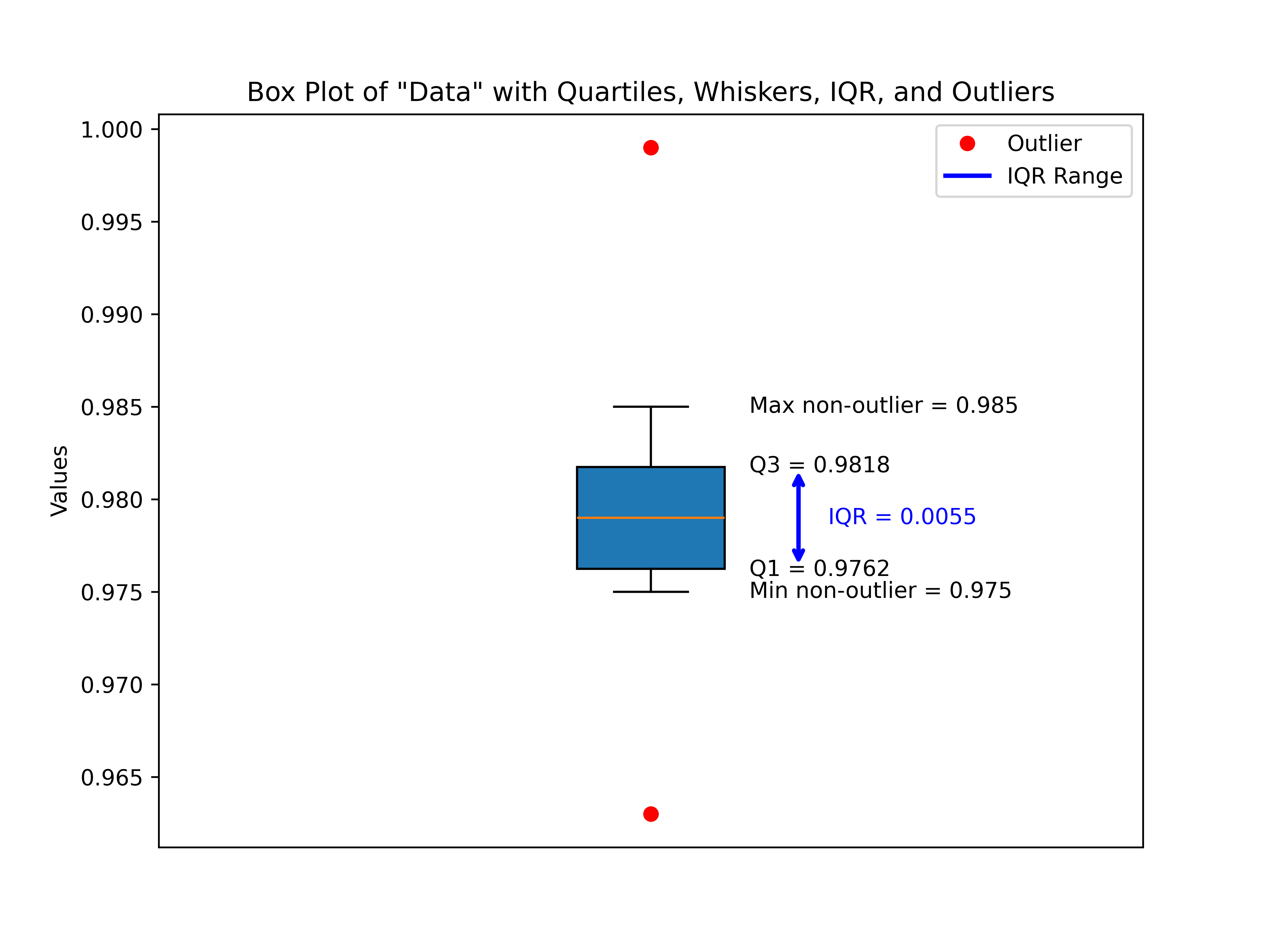
Figure 13 - Descriptive Statistics Data Example with Box Plot of Data - Quartiles, Whiskers, IQR, and Outliers
The box plot emphasizes what the raw descriptive statistics hinted at: this dataset is extremely compact around its center values. The median (0.9790) sits neatly between Q1 and Q3, showing symmetry, while the narrow IQR (just 0.0055 units wide) highlights a tight clustering of nearly all observations.
The plot also reveals two outliers, one below the lower fence (0.9630) and one above the upper fence (0.9990). Although these are flagged statistically, they still fall reasonably close to the distribution’s central band, and their presence doesn’t drastically distort the shape. Rather, they underscore the sensitivity of box plots at detecting minor deviations in highly concentrated datasets.
Overall, the box plot confirms that aside from two mild outliers, the dataset is centered, symmetric, and densely packed with values around the median. This matches neatly with what we saw through skewness and kurtosis earlier—nearly no skew and a very “tight” distribution with slightly heavier tails.
With this confirmation in hand, we can now turn more directly to skewness and kurtosis in our dataset—continuing the descriptive stats thread from our previous post to see how numerical and visual perspectives complement one another.
Skewness and Kurtosis Analysis
While the box plot gave us a compact snapshot of the spread and a hint of symmetry, measures like skewness and kurtosis let us quantify aspects of the distribution’s shape with greater precision. For our special dataset, we computed both values and overlaid them with visualizations: a histogram with kernel density estimate (KDE) and Gaussian curve shading (Figure 14).
Skewness Results
- Calculated Skewness (bias‑corrected): 0.52
- Direction: Right‑skewed (tail extends to the right)
- Interpretation: Moderate skew
The skewness value of 0.52 falls just above the “slight skew” boundary, placing it in the moderate right‑skew range. This suggests that while the majority of data points are clustered tightly around the central region, there is a subtle tendency for larger values to extend farther to the right. This aligns with what we observed in the box plot: cluster symmetry around the median, but with a single high‑value outlier pulling the tail to the right.
Kurtosis Results
- Calculated Excess Kurtosis (bias‑corrected): 2.88
- Interpretation: Heavy tails and sharp peak (leptokurtic)
The kurtosis measure tells us that the dataset is leptokurtic—it has a sharper peak than a normal distribution and thicker tails. In practice, this means data values not only cluster more tightly around the center than normal (reinforcing our observation of an unusually narrow IQR) but also allow for more extreme points in the tails—precisely what our outliers illustrated.
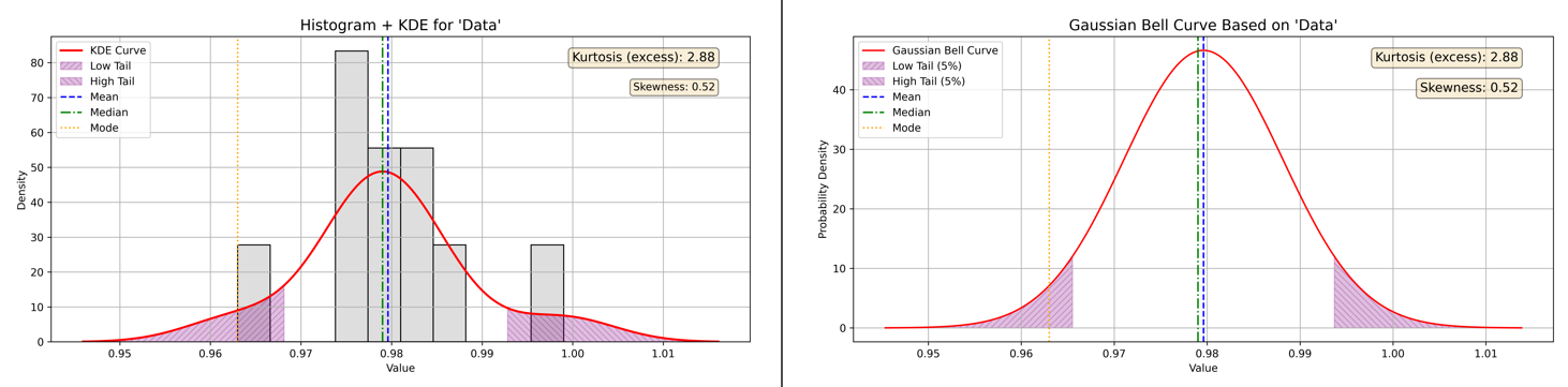
Figure 14 - Descriptive Statistics Data Example Combined Skewness & Kurtosis Visualization
To tie these concepts together, Figure 14 overlays the histogram, KDE distribution, and a Gaussian reference curve, with shaded regions highlighting skewness and kurtotic effects. The peak stands higher and narrower than a Gaussian “bell curve,” while the right tail stretches farther, echoing the numerical results.
Interpretation and Synthesis
Together, these descriptive statistics and visualizations tell a consistent story:
-
Compact center → Most values hover close to the median (0.9790), confirmed by small IQR.
-
Moderate right skew → A subtle pull toward the upper end due to high‑value points.
-
Leptokurtic shape → A distribution sharper than normal, with density tightly packed in the middle but capable of heavier tails.
This special dataset, then, is not perfectly normal—it is slightly stretched to the right and peaked in the center, yet still susceptible to extreme outcomes. Crucially, both skewness and kurtosis add nuance to what we saw in the box plot: symmetry isn’t perfect, and tight central clustering comes at the cost of heavier tails.
🔧 Tools and Resources
To make this analysis reproducible and extendable, I’ve made both the special dataset and the Python scripts used in this post available on my GitHub repository:
Descriptive Statistical Data Visualization Toolkit
Dataset
data.csv— the special data analyzed in this post
Visualization Scripts
boxplot_data.py— generates Figure 13 (annotated boxplot with outliers)skew_kurtosis_combined.py— generates Figure 14 (histogram, KDE, and Gaussian overlay)
These resources allow you to experiment directly with the data, modify the scripts, or adapt them for your own projects. Since the scripts are lightweight and built around matplotlib, pandas, and scipy, they should run easily in most Python setups.
Closing Thoughts and What’s Next
This walk‑through started with descriptive statistics from our previous blog post on the topic, then advanced through box plot visualization, and finally into skewness and kurtosis analysis. We used our original descriptive statistics data from the previous post to illustrate box plot, skewness, and kurtosis analysis of that data in Figures 13 and 14. Along the way, we saw how numbers and visuals complement one another: the descriptive stats gave us precision, while the box plot and combined histogram plots provided an immediate, intuitive picture of structure, symmetry, and tails.
While our special dataset is tightly clustered, its subtle right skew and leptokurtic shape remind us that distributions can look “normal‑ish” yet still carry nuances that affect interpretation and modeling. This is why moving beyond descriptive stats into visual and shape‑based measures is so valuable.
With the dataset and scripts in hand, I encourage you to experiment, apply these tools to your own data, and explore how skewness and kurtosis reveal insights beyond simple averages and variances.
But understanding data distributions is just one piece of the broader forensic science puzzle. Ensuring that forensic methods themselves are scientifically sound and legally defensible requires rigorous, empirical method validation. In digital and multimedia forensics especially, there remains a significant gap, a lack of detailed, actionable frameworks for validating methods to meet today’s heightened scientific and legal standards.
This gap is not merely academic; it carries real-world consequences, as illustrated by recent legal scrutiny in cases like State of Washington v. Puloka (2024). Addressing the “method validation” issue is critical to maintaining forensic science’s integrity and the justice system’s trust.
In the next series of posts, I will introduce a research-focused, stepwise framework designed to guide forensic practitioners through empirical method validation, from statistical planning and dataset construction to legal alignment and transparent reporting.
Stay tuned as we explore how this framework can help advance scientific rigor and courtroom reliability in forensic evidence analysis.
References:
- Frost, J. (2020). Introduction to Statistics: An Intuitive Guide for Analyzing Data and Unlocking Discoveries. Statistics By Jim Publishing. ISBN 978-1-7354311-0-9.